Materials & Decoration
Why Your Cup Colour Doesn't Match the Pantone Chip — and How to Approve It Properly
Photography from our factory archive is used where relevant. Images labelled illustration are conceptual and are not production or inspection records.
Contents| hide
- Quick Answer
- Where Does the Difference Come From?
- Why Does the Same Number Look Different on Plastic and on Paper?
- Should You Specify Pantone, RAL or a Physical Sample?
- What Does ΔE Actually Tell You?
- How Should You Approve a Colour So It Sticks?
- Which Colour System Should You Use — Masterbatch, Pre-compound or Dry Blend?
- What Shifts Colour Without Anyone Touching the Formula?
- How Do You Stop Colour Drifting on Repeat Orders?
- What Do You Do When a Batch Arrives Off-Colour?
Quick Answer
A Pantone number describes ink printed on paper. Your cup is pigment dispersed in plastic, moulded into a shape, with a surface texture and a gloss level. The chip and the cup are two different materials doing two different things with the same reference — so a small difference is normal, not a mistake.
What you can control is the size of the difference and whether it repeats. Approve a physical master sample (not a screen preview), check it under the light your customer will actually use, write a tolerance into the order, and keep a signed reference piece on both sides. Do those four things and colour stops being a recurring argument.
Below: where the difference comes from, what ΔE numbers mean in practice, which colour system to specify, the seven production variables that shift colour without anyone changing the formula, and a triage procedure for a batch that arrives wrong.
Where Does the Difference Come From?
One number passes through four rendering stages before it reaches your customer. Each stage can move it.
| Stage | What it is physically | Typical drift | Who controls it |
|---|---|---|---|
| 1. The Pantone chip | Ink on coated or uncoated paper, viewed under a specific illuminant | The reference itself differs between coated and uncoated books | You, when you choose which book |
| 2. The colour concentrate | Pigment dispersed in a carrier resin, matched to the chip | Very close — this is the step where a lab can hit ΔE under 1.0 | Supplier, at matching stage |
| 3. The moulded part | Pigment in your actual resin, after heat, flow, texture and gloss | This is where most of the visible drift appears | Both sides — material, texture and process |
| 4. The printed logo | A second ink layer sitting on top of the plastic | Often the largest single mismatch on the finished product | Supplier, at print proof stage |
The buyer holds the chip against the cup under office lighting and says it is too dark. The factory holds the same cup under a daylight lamp and says it matches the master. Both are telling the truth. The disagreement is about light and surface, not about the formula.
Why Does the Same Number Look Different on Plastic and on Paper?
Four physical reasons, in order of how much they matter:
- Surface gloss. A gloss surface reflects a hard highlight and reads darker and more saturated; a matte surface scatters light and reads lighter and flatter. Same pigment, visibly different cup.
- Opacity. Paper is opaque. Plastic can be opaque, translucent or clear. A translucent colour shows the wall behind it, so the cup reads darker where the wall is thick and lighter at the rim.
- Texture. A moulded texture (sandblast, leather grain, fine matte) changes how light leaves the surface. Moving from smooth to textured on the same colour will read as a half-step lighter, sometimes more.
- Material. PP, ABS, PET, Tritan and silicone each render pigment slightly differently. A colour approved on an ABS lid will not automatically match on a PP body.
There is also a formal name for the lighting problem: metamerism. Two colours can match under daylight and diverge under warm shop lighting or under LED. If your product is sold in a retail environment with a specific light, the approval has to happen under that light — or at least be checked under it before you sign.
Should You Specify Pantone, RAL or a Physical Sample?
Use all three, in this order of authority. Most colour disputes start with a buyer sending only a number.
| What you send | What it is good for | What it cannot do |
|---|---|---|
| Pantone number (C or U) | A shared starting point everyone can look up | Does not describe plastic surface, gloss or opacity |
| Pantone Plastics chip (PQ) | A reference already made in plastic rather than ink | Still not your material, your texture or your gloss |
| A physical sample you already own | The most reliable reference — it is the real thing | Needs to be posted, and it ages |
| A measured value (L*a*b*) | Removes opinion from the discussion | Useless without the same instrument and geometry on both sides |
The strongest brief is a number plus a physical sample plus a sentence about the surface: “match this Pantone to this sample, on a matte textured body, gloss level 5–8, opaque.” That sentence removes three of the four variables before the first sample is made.
What Does ΔE Actually Tell You?
ΔE is a single number for the distance between two colours in a standard colour space. It turns a subjective argument into a measurement — with one caveat: ΔE is only comparable when both readings come from the same instrument type and the same measurement geometry. A supplier quoting ΔE from a different device is quoting a different ruler.
| ΔE | What a person sees | Sensible use |
|---|---|---|
| 0 – 1.0 | Not distinguishable, even side by side | Adjacent parts that must look like one object: body and lid, cup and coaster |
| 1.0 – 2.0 | A trained eye sees it side by side, not across a room | Brand-critical solids, gift sets |
| 2.0 – 3.5 | Visible at a glance when two pieces are held together | General drinkware, promotional orders |
| 3.5 – 5.0 | Reads as a different shade, not a slightly different batch | Only acceptable for deliberately varied ranges |
| Above 5.0 | A different colour | Not a match |
Two practical rules. First, agree the tolerance before the sample is made, not after it arrives. Second, never accept a ΔE figure alone — ask for it together with a photograph and a physical sample, because ΔE cannot see a patchy surface, a flow line or a colour that is even but wrong.
How Should You Approve a Colour So It Sticks?
What If You Cannot Post a Physical Sample?
Send the number, then ask the factory to courier three moulded chips in the intended material and finish, and keep one of them as the reference. A photo of a chip on a white desk is not a reference: the camera white balance, the screen and the room light each move the colour more than the tolerance you are arguing about.
If the product must match something you already own — an existing cup, a printed carton, a brand guideline printed on paper — send that object, not its description. Matching to a physical article is faster and cheaper than matching to a number that has already been interpreted once.
This is the part that decides whether your second order matches your first. Seven steps, and the whole thing takes about a week.
- Send a reference, not a screenshot. A number, a physical sample, or both. Screens render colour unpredictably and are not a reference.
- Say where it will be seen. Retail shelf under warm light, outdoor event in daylight, or a photo studio. This decides the illuminant you approve under.
- Get a physical master sample. Not a colour card, not a digital mockup — a moulded part in the intended material, texture and gloss.
- Check it under at least two light sources. Daylight (D65, roughly 6500K) first, then the light your customer will actually use — warm indoor, or cool LED retail. If it holds in both, it is a robust match.
- Sign and date the sample. Three pieces: one retained by the buyer, one by the factory, one sealed and stored. The sealed one is what settles a dispute a year later.
- Write the tolerance into the order. One line: the approved reference, the ΔE limit, the light source used for approval, and “no change to pigment, material or texture without written approval”.
- Photograph the approved piece in fixed conditions. A photo is not the reference, but it catches gross errors on incoming batches faster than anything else.
“Colour to be matched to approved master sample dated [date], ΔE ≤ 2.0 measured on [instrument], checked under D65. Material, pigment supplier, texture and gloss to remain unchanged for the life of the order. Any change to be notified and re-approved in writing before production.”
Which Colour System Should You Use — Masterbatch, Pre-compound or Dry Blend?
The same colour can be delivered three ways, with very different consistency. This is the single most under-specified item in colour briefs.
| System | How it works | Consistency | Best for |
|---|---|---|---|
| Pre-compounded colour | The resin arrives already coloured from the compounder | Highest — the whole batch is one lot | Brand colours, repeat programmes, large volumes |
| Masterbatch | A concentrated colour pellet is let down into natural resin at the machine | Good, if the let-down ratio is fixed and weighed | Most custom work; economical at mid volume |
| Dry blend | Pigment powder blended into resin before moulding | Lowest — separation and dusting cause drift | Short runs, internal parts, prototyping |
Ask which one you are being quoted. A price difference between two suppliers on the same colour is often this, and nothing else. If the answer is masterbatch, ask for the let-down ratio in writing — a ratio that drifts from 2% to 2.2% is a visible colour change on light shades.
What Shifts Colour Without Anyone Touching the Formula?
Seven production variables. All of them are normal process variation, none of them require a new colour, and every one of them has produced an angry email.
| Variable | What happens | How to control it |
|---|---|---|
| Regrind content | Ground scrap mixed back in darkens and dulls the shade, most visibly on light colours and pastels | Cap regrind at an agreed percentage, keep it out of light shades entirely |
| Melt temperature | Some pigments shift hue or fade above a threshold; too cool leaves unmelted specks | Fix the temperature window in the process sheet |
| Residence time | Long dwell in the barrel degrades heat-sensitive pigments | Control shot size and machine stop time |
| Wall thickness | Translucent colours read darker where the wall is thicker | Approve the sample on the thickest section of the part |
| Mould texture | A new texture or a polished band changes perceived lightness | Texture is part of the colour approval, not a separate decision |
| Gloss level | Same pigment, different gloss, different appearance | Specify a gloss range (GU) with the colour |
| Print ink | The logo ink is a separate material with its own gloss | Approve the printed piece, not the blank, as the final reference |
There is an eighth that is not a variable at all: a different mould. If your supplier runs the same colour in a second cavity set or a second machine, expect a small difference. For a multi-part product, insist that body and lid come off the same colour lot — mixing lots is exactly how a two-tone set happens by accident.
How Do You Stop Colour Drifting on Repeat Orders?
- Keep the sealed reference. Not a chip, not a photo — the physical approved piece, stored away from light and heat. Plastic yellows and ink fades, so replace the working reference every 12–18 months against the sealed one.
- Fix the recipe to a single compounder. Two suppliers matching the same Pantone number will produce two different plastics. Colour is a supply-chain commitment, not a specification.
- Order colour in one lot where possible. A single 500 kg pre-compound lot covers a large order and removes lot-to-lot drift entirely.
- Re-approve after any material change. Recycled content, a new resin grade or a formulation update from the compounder all reset the colour. Ask to be told before the change, not after.
- Re-approve after any tooling change. New texture, re-polished cavity, new gate — all change appearance.
What Do You Do When a Batch Arrives Off-Colour?
Work in this order. Most disputes are settled at step 3, and the ones that are not usually turn out to be a reference problem rather than a production problem.
- Put the batch next to the approved master, in the same light. Not a photo, not a chip, not memory. Daylight or the agreed light source.
- Check whether the whole batch is off, or only part of it. A patchy difference points to masterbatch dispersion or mixed lots; a uniform difference points to the reference or the pigment lot.
- Measure it. A ΔE reading from the same instrument type decides whether you are inside the agreed tolerance.
- Compare against the retained reference, not the last shipment. If the last shipment was already drifting, you have been comparing to the wrong thing.
- Decide: accept, sort, or remake. Inside tolerance and the product still works — accept with a note. Outside tolerance but usable at a discount — agree in writing. Outside tolerance and brand-critical — remake the affected quantity, and fix the process cause before the next run.
Whatever the outcome, write down the cause. A colour complaint that is not traced to a variable will happen again on the next order, and the second conversation is always less friendly than the first. If you are still at the stage of choosing a supplier, the questions in what an AQL inspection tells you are the ones to ask about incoming colour lots.
Related reading

Does Your Custom Cup Need a New Mould?
The arithmetic that decides whether to pay for tooling, and what actually moves a mould price.
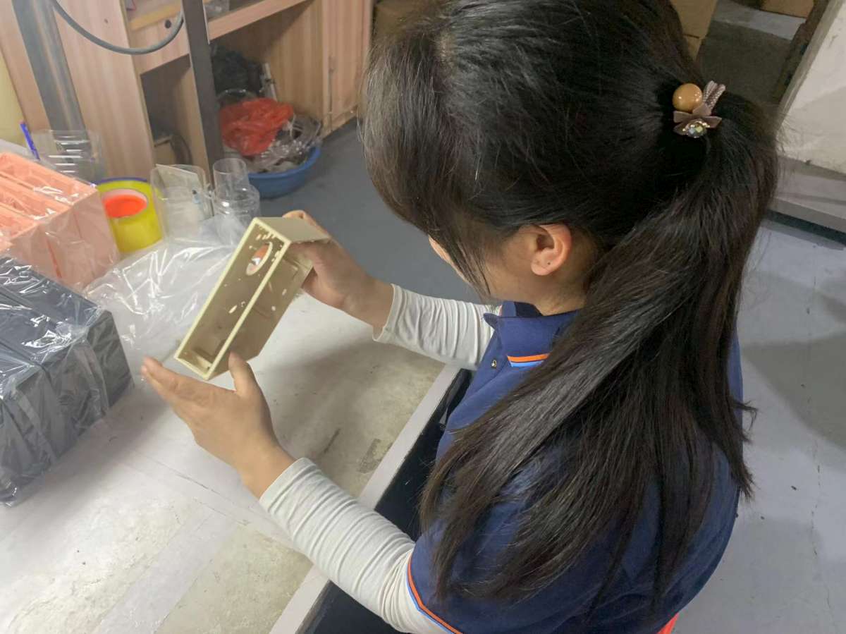
What an AQL Inspection Actually Tells You
What the percentages mean, how many pieces get checked, and six things an inspection cannot see.
Customization Guide
The four layers you can change — colour and surface, logo, lid and accessories, packaging — and what each one costs in volume.
Send a colour, get a moulded sample
Send the Pantone number, the surface finish and where the product will be seen. You get a moulded sample in the intended material and texture, not a printed card.
Request a colour sample